Description
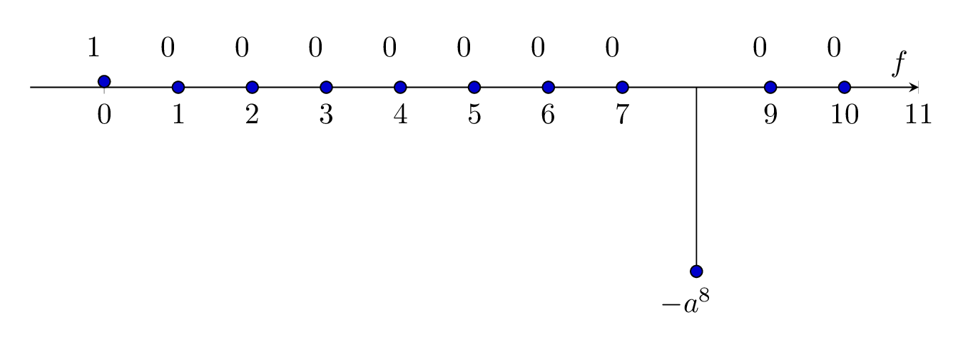
This LaTeX code generates a plot of a discrete-time signal using the TikZ and pgfplots packages. The signal is plotted on a two-dimensional axis with frequency () on the horizontal axis and amplitude on the vertical axis.
The plot is defined inside a tikzpicture environment, which is embedded within an axis environment defined by pgfplots. Several options are specified for the axis environment, including the height, width, axis labels, tick marks, and ranges for the horizontal and vertical axes.
The signal is represented by a series of discrete samples plotted as vertical lines using the \addplot command. The signal values are specified as coordinates in the (x,y) format, where x is the frequency and y is the amplitude. The \node command is used to place labels at specific points on the plot to indicate the value of each sample.
Overall, this code generates a simple plot of a discrete-time signal with eight non-zero samples and one negative sample at a specific frequency.
Keywords
tikz, pgfplots, amsmath, filecontents, standalone, axis, height, width, axis x line, axis y line, every axis x label, xlabel, xtick, ymin, ymax, xmax, xmin, addplot, ycomb, plot coordinates, node, label.
Source Code
\documentclass[border={10pt}]{standalone}
\usepackage{tikz,pgfplots,filecontents,amsmath}
\pgfplotsset{compat=1.5}

\begin{document}

\begin{tikzpicture}
\begin{axis}
[%%%%%%%%%%%%%%%%%%%%%%%%%%%%%%%%%%%
height=5cm,
width=\textwidth,
    axis x line=middle,
    axis y line= none,
%    ylabel={Signal Spectrum of $x(t)$},
     every axis x label={at={(current axis.left of origin)},anchor=south west},
%    every axis y label={at={(current axis.above origin)},anchor= north west},
    %every axis plot post/.style={mark options={fill=black}},
    % every axis plot/.append style={ultra thick},
   xlabel={$f$},
%    ylabel={$\boldsymbol{x[n]}$},
    xtick={0,1,...,7,9,10,11},
    ymin=-40,
    ymax=10,
    xmax=11,
    xmin=-1,
]%%%%%%%%%%%%%%%%%%%%%%%%%%%%%%%%%%%
%\addplot+[ycomb,black,thick] table [x={n}, y={xn}] {data.dat};
\addplot+[ycomb,black] plot coordinates
{(0,1) (1,0) (2,0) (3,0) (4,0) (5,0) (6,0) (7,0) (8,-32) (9,0) (10,0)};
\node[label={{$1$}}] at (axis cs:0,0) {};
\node[label={{$0$}}] at (axis cs:1,0) {};
\node[label={{$0$}}] at (axis cs:2,0) {};
\node[label={{$0$}}] at (axis cs:3,0) {};
\node[label={{$0$}}] at (axis cs:4,0) {};
\node[label={{$0$}}] at (axis cs:5,0) {};
\node[label={{$0$}}] at (axis cs:6,0) {};
\node[label={{$0$}}] at (axis cs:7,0) {};
\node[label={{$-a^{8}$}}] at (axis cs:8,-45) {};
\node[label={{$0$}}] at (axis cs:9,0) {};
\node[label={{$0$}}] at (axis cs:10,0) {};
\end{axis}
\end{tikzpicture}

\end{document}